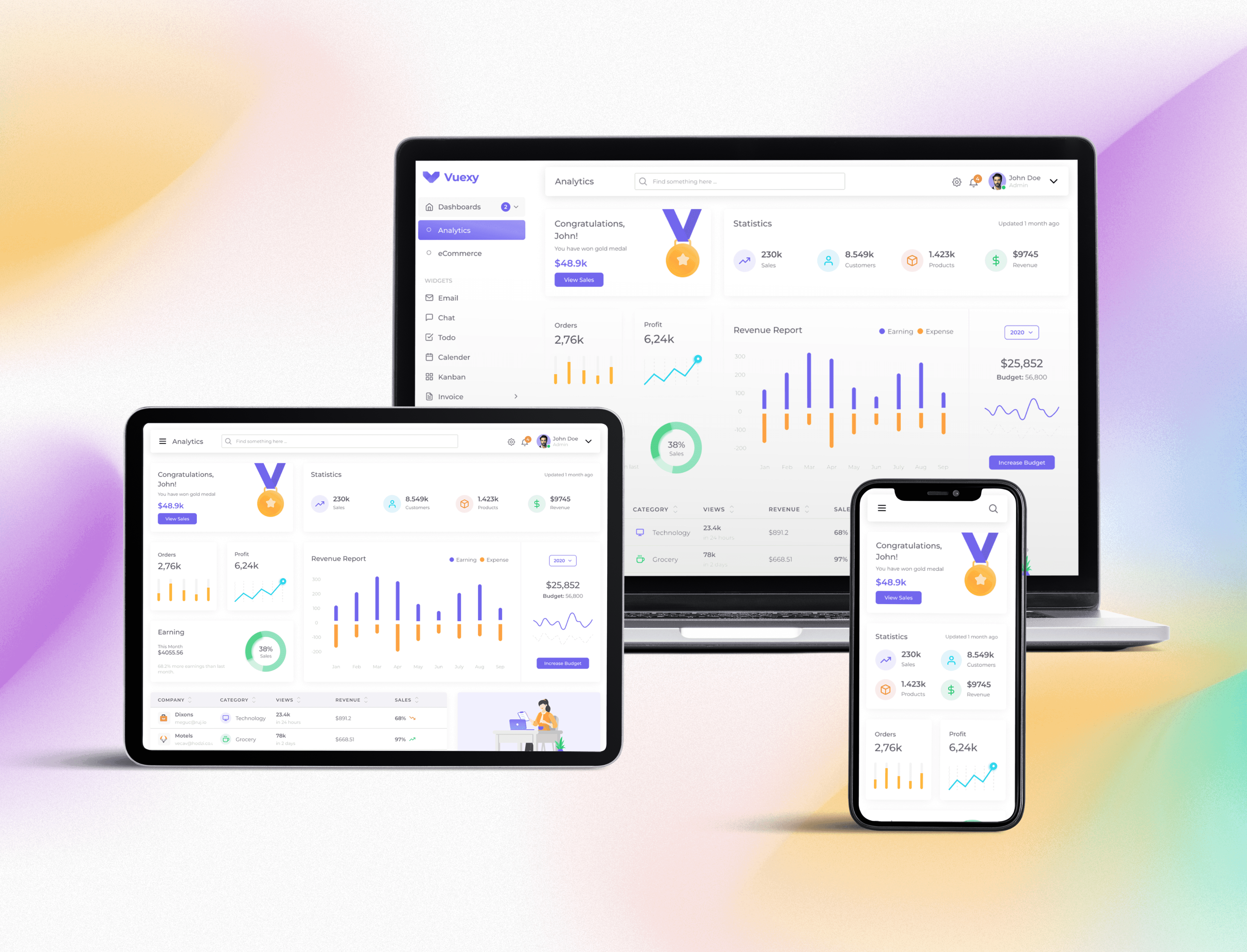
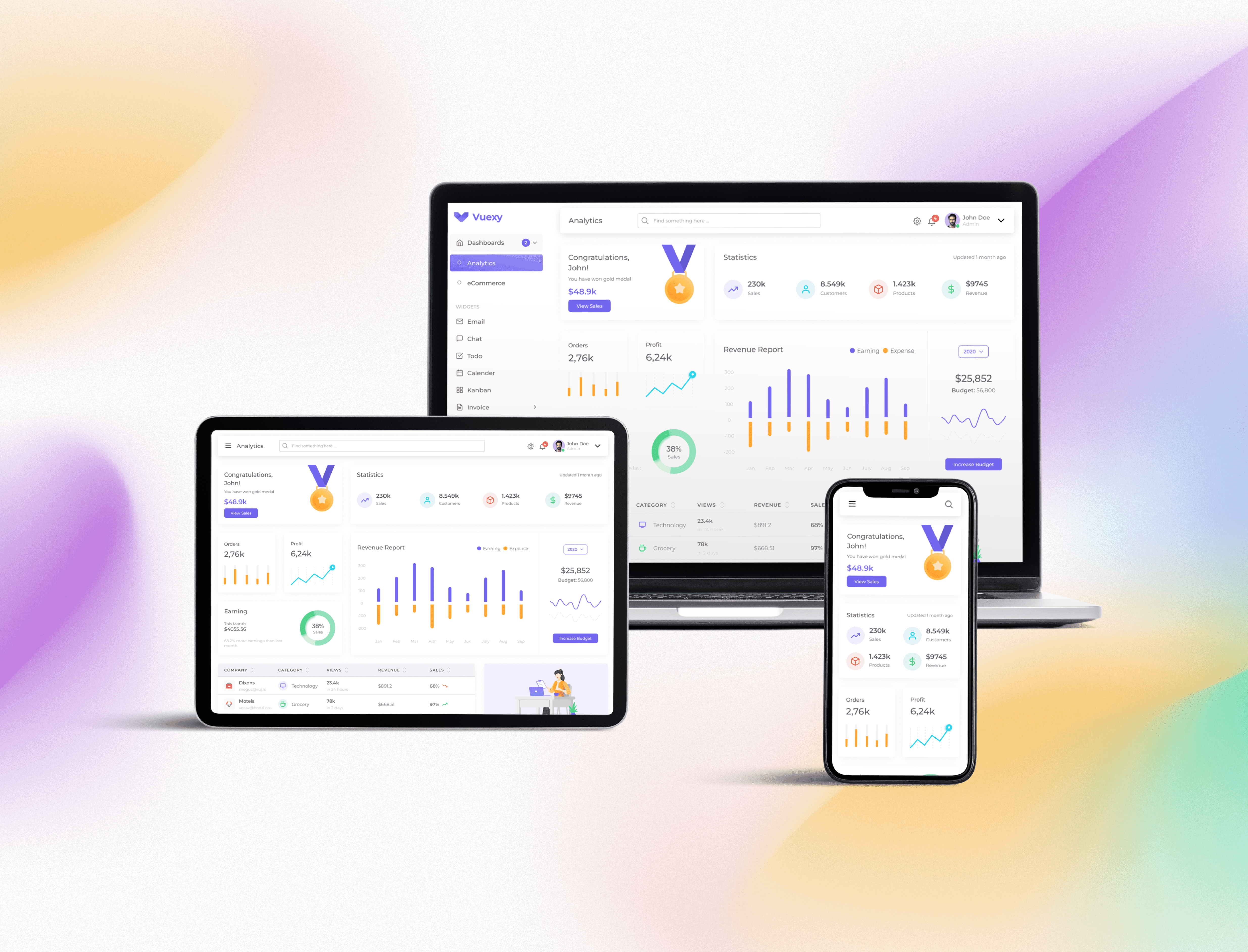
Responsive design for exist dashboard
Responsive design that provides an optimal user experience across a range of devices maintaining the integrity of provided design
MY ROLE
Solo UI/UX Designer
PROJECT TYPE
Case Study
Task
Create responsive design for all necessary devices based on a current provided design.
01 SELECTING MODULAR GRID
Modular grid
At first I defined the modular grid for the existing layout.
At first I defined the modular grid for the existing layout.
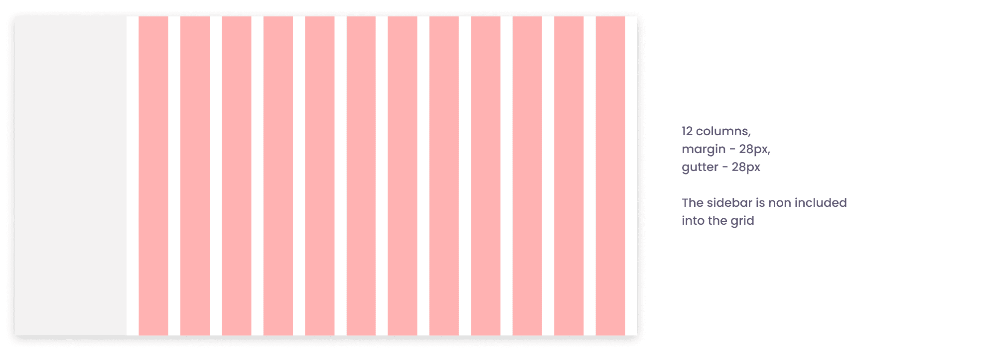
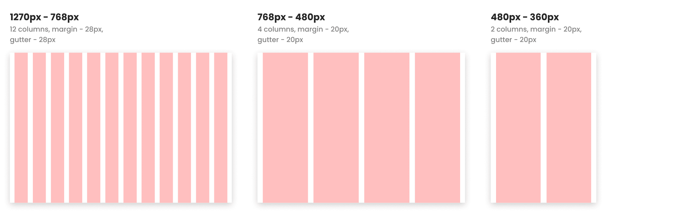
Choosing breakpoints
After selecting the modular grid I selected breakpoints for all the screen widths that are less than 1440px and create grids for these screens.
The main breakpoints was 1270px, 1024px, 768px, 480px, 360px
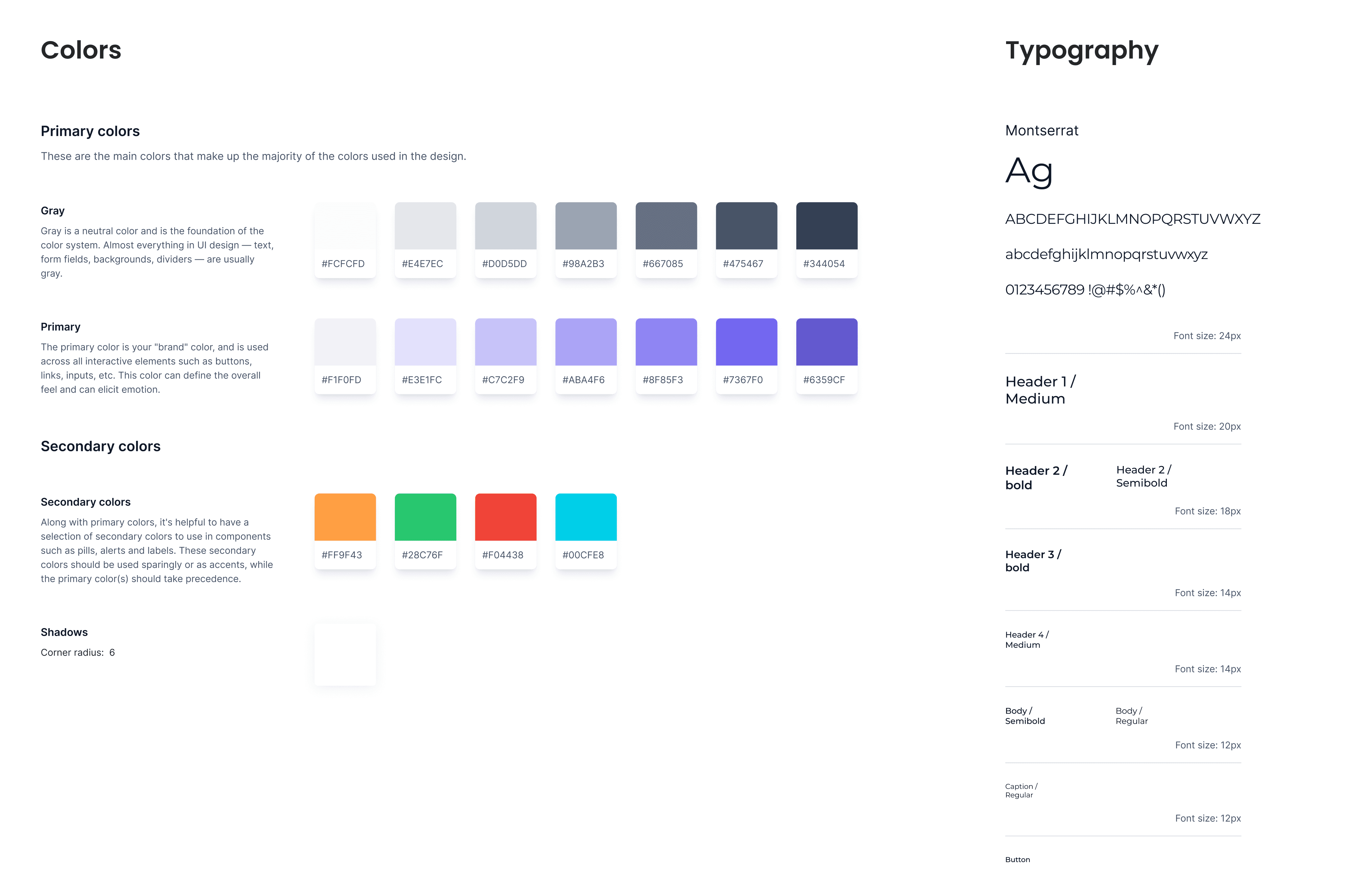
02 UI KIT
UI Kit
03 RESPONSIVE CARDS
Cards variants
All content is organized into cards and for all type of cards I created a variants which will be suitable for each type of screen width and will adapt to every grid.
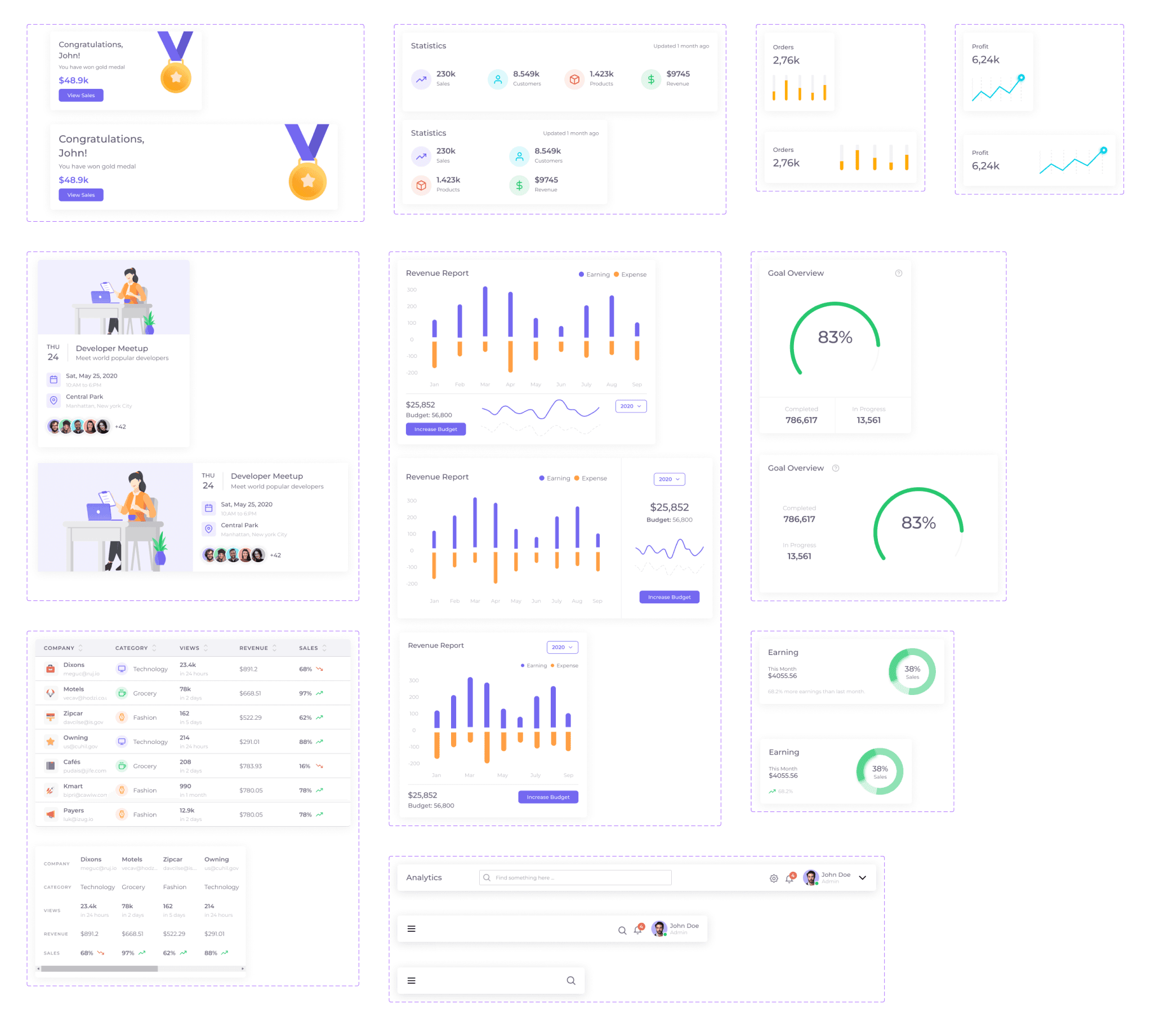
Breakpoints variants
For each resolution of defined grid I distributed the cards into rows, using the notion of layout flow.
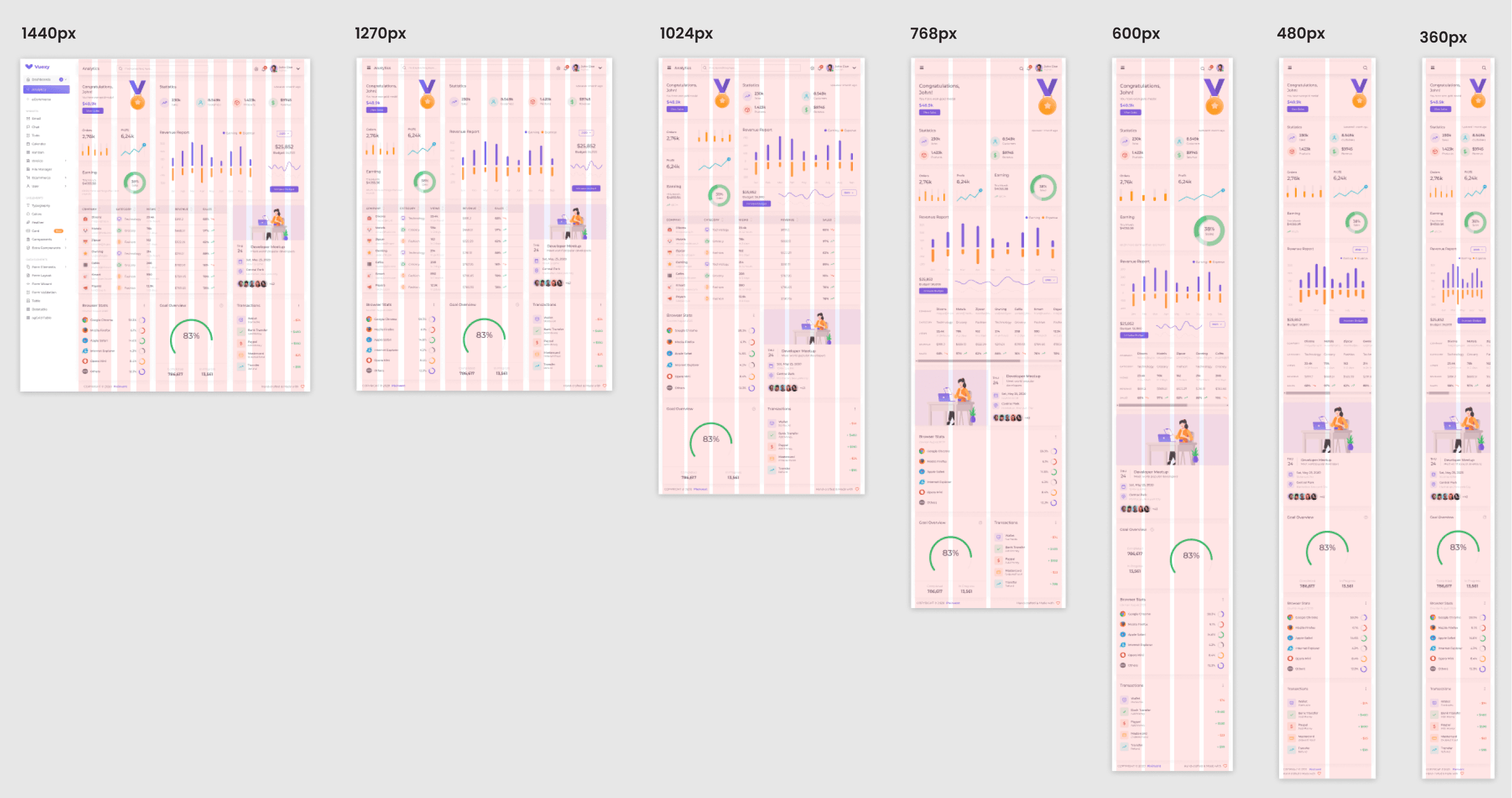
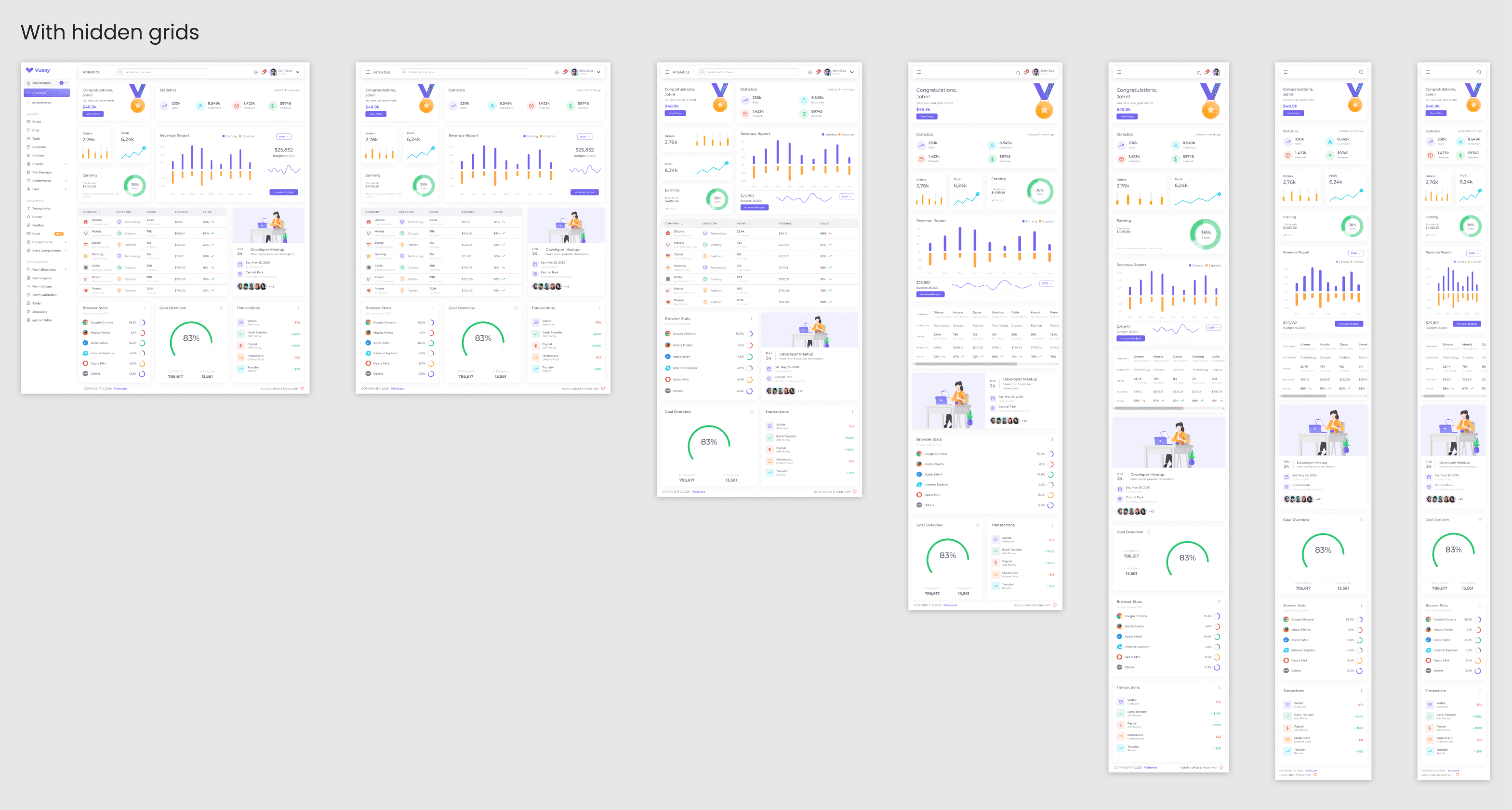
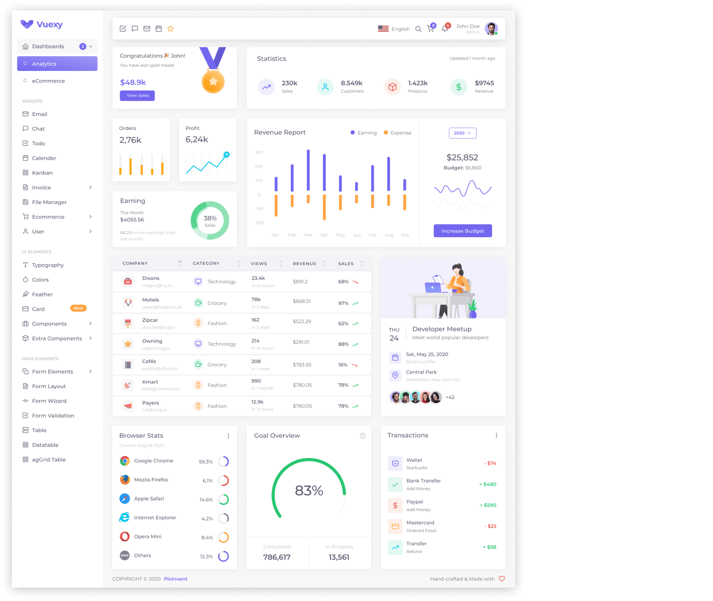
04 FINAL RESPONSIVE DESIGN
The final UI Design
05 CONCLUSION
Project summary
During the project, I set up a modular grid structure for the provided layout, defined breakpoints for different screen sizes, and created grids specific to each of these screens.
Using a UI kit, I developed responsive card components and applied them consistently across all relevant screens for an adaptable and user-friendly design on various devices.
Let’s
connect!
© 2023 Daria Shagina | Built with Framer